FALL 2020
RideSeventyFive
To promote the use of public transportation and reduce carbon emissions, RideSeventyFive integrates the Google Maps API and geolocation to generate a randomized set of hand-picked places in LA that are accessible through bus from the user’s current location. With a click of a button on our unique and responsive interface, RideSeventyFive will automatically load the transit route to a user’s chosen destination in Google Maps.
Purpose:
The web-app RideSeventyFive was part of a campaign to promote the use of public transit in LA in order to reduce carbon emissions. It was my team’s semester project for our M-School Marketing For Good class, inspired by the UN’s Sustainable Development Goals. The basis for our campaign was to make public transit an adventure to ease any anxiety first-time riders might have.
My Role:
Designing graphics, developing our website, and creating promotional content
Site Features:
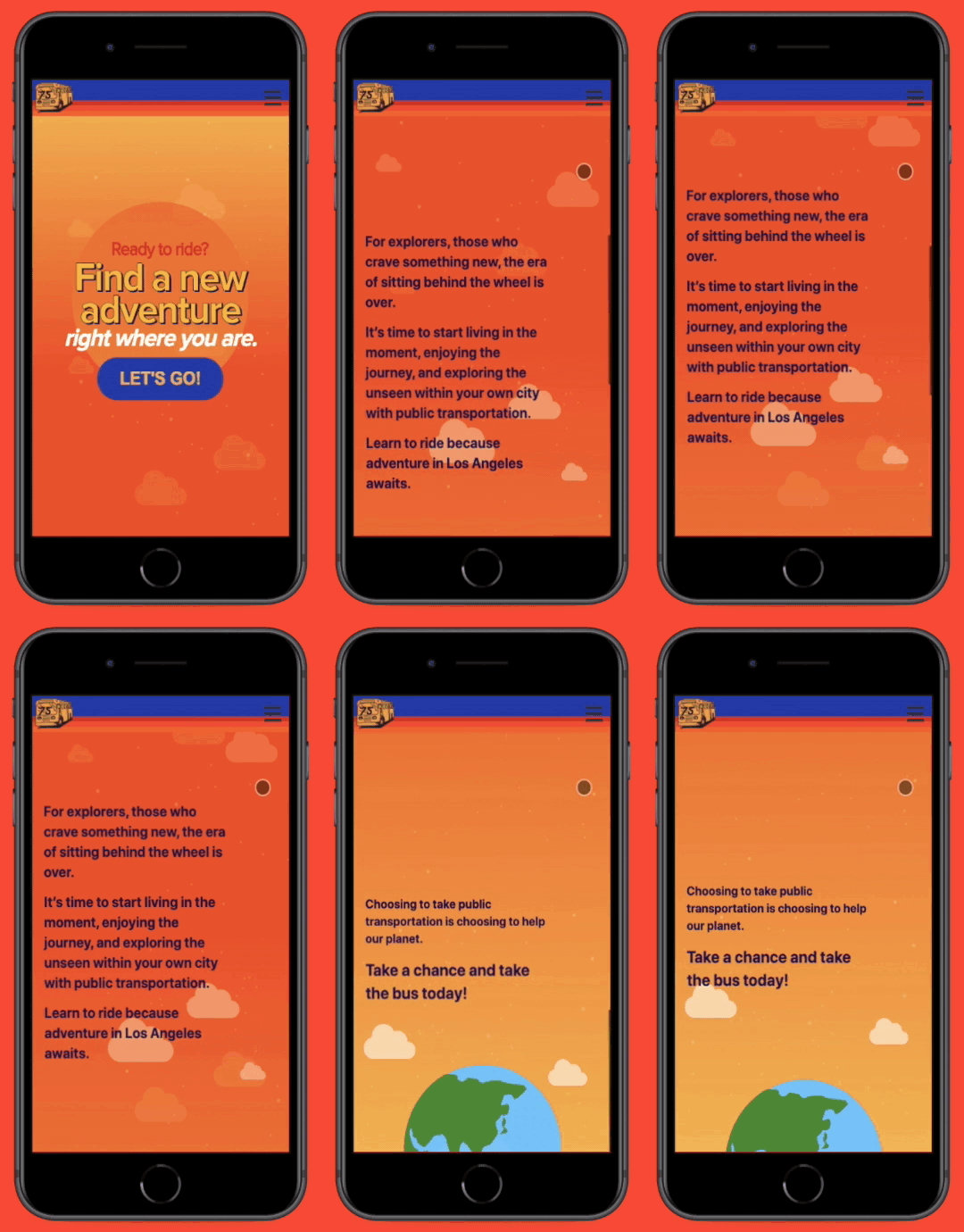
Animated homepage — Reason behind button press changes, button spins and changes color
Geolocation — User’s current location is retrieved with permission
Google Maps Integration — Using calls to the Google Maps API, distance to a chosen location, time the drive will take on the bus, and the transit route is available for users to see. With a click of a button, the user is redirected to Google Maps where the transit route is already loaded for them.
Uniquely generated set of “tickets” to hand-picked locations in LA
Dynamically generated “reciepts” — After the user chooses a ticket, a reciept is generaated which dynamically displays information about their destination with other fun messages and details
Fully responsive design — UI is optimized and consistent for all devices!
Hosted through Firebase
Design Decisions:
Influence from 70’s era (play on ‘75’)
Fun & exciting feel for interface
Bold, warm colors
“Gen-Z” inspired language
Inspirations from current graphic design trends
I created a moodboard to get a sense of the creative direction I wanted for the visual identity of RideSeventyFive
Original Design Mockups:
From my previous experiences, I thought it was best to have a mobile-first approach to the design.
Home Page
Destination/Ticket Options
Ticket Selection
Original Implementation:
Design Pivot:
We got great, positive feedback from classmates & professors for the initial mockups and demo of the original UI. However, something didn’t feel right to me; I wasn’t happy with the feel of it. It felt a bit childish to me and reminded me of a Crayola crayon box. The steps for the directions were a little redundant and unnecessary to me as well, and it just wasn’t very fun to use. This to me didn’t align with our brand, so I decided to make some changes.
Updates:
Added features -
Replaced direction steps with fun messages and info about the journey a user would take to their location
“Receipt” after choosing ticket
Changes -
I changed up the look to be a little bit edgy to avoid looking too childish like it did before.
I made graphics with textures to add to the site to align more with graphic design trends and limited the color palette.
Overall, I think the changes I made to the UI fit better with our brand & visual identity. I got positive reviews from my teammates, classmates, professors, and mentors, so I think it was a success!


